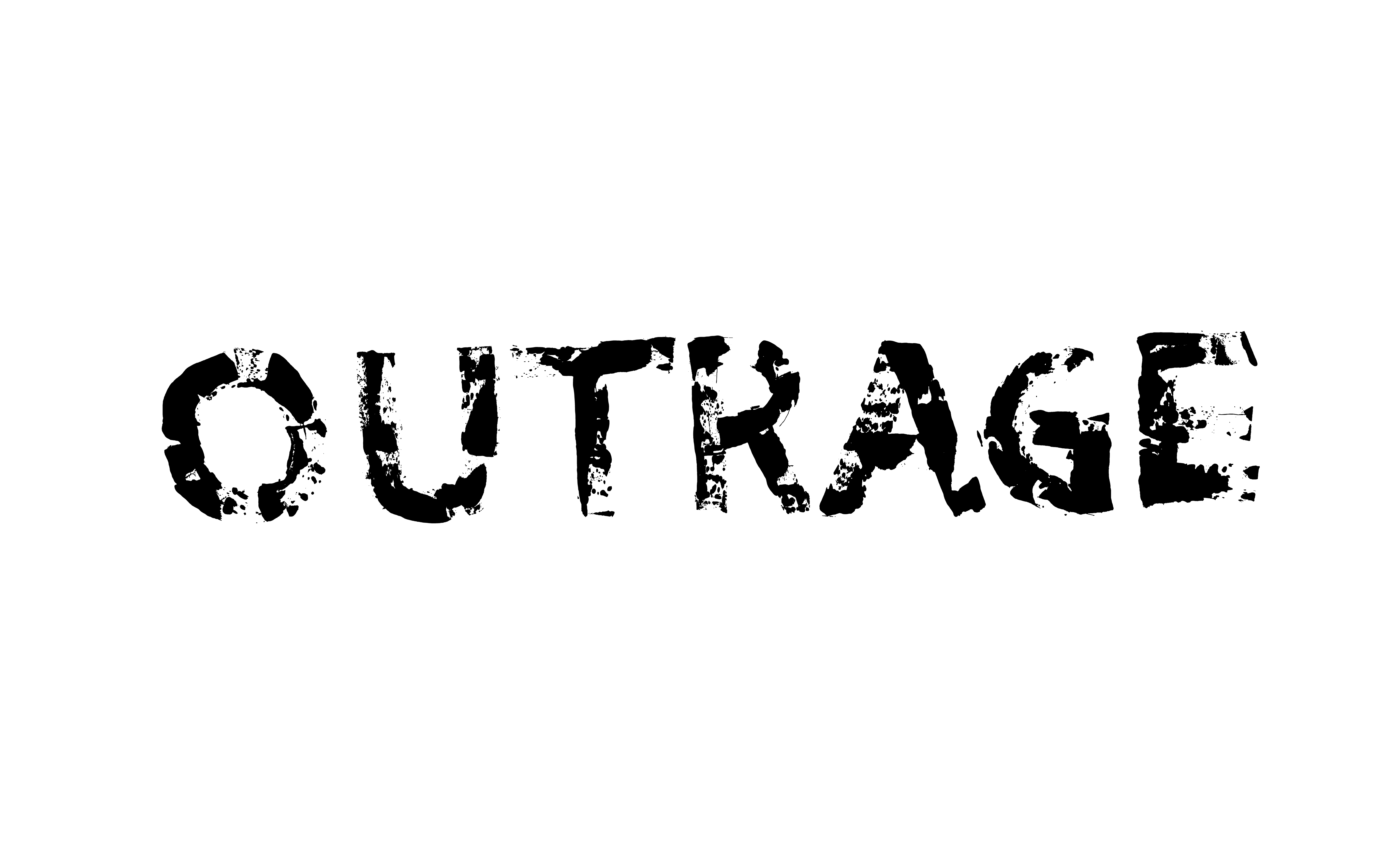


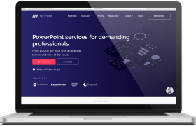
Nomore
WEBSITE REDESIGN Nomore During my internship at Nomore I was a part of a team developing their new website. The company Nomore offers professional businesses their assistance outsourcing and developing professional Power Point services. The task was to tranform their former website into a new and easier understandable website that could convert more customers. My […]
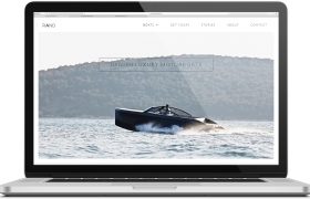
RAND Boats
WEBSITE / IDENTITY RAND Boats Next to my studies in Digital Concept Development, I worked parttime as a webmaster and webdesigner at RAND Boats as a part of the marketing team. RAND Boats design and produce danish designed luxury motorboats, with a strong focus on sustainability. I designed and developed the website in WordPress using […]
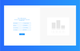
bachelor project
ONBOARDING FLOW Bachelor project Continuing the work from my internship I worked to create an onboarding flow, to introduce new users to the new Saas tool for thinkstep.com (now Sphera.com). This project is protected by an NDA. Details Client thinkstep.com Sustainability Consulting, Software and Data My focus Collecting data, dataprocessing, research, interaction- and navigationprinciples, user flows, designpriciples wireframing, […]