ONBOARDING FLOW
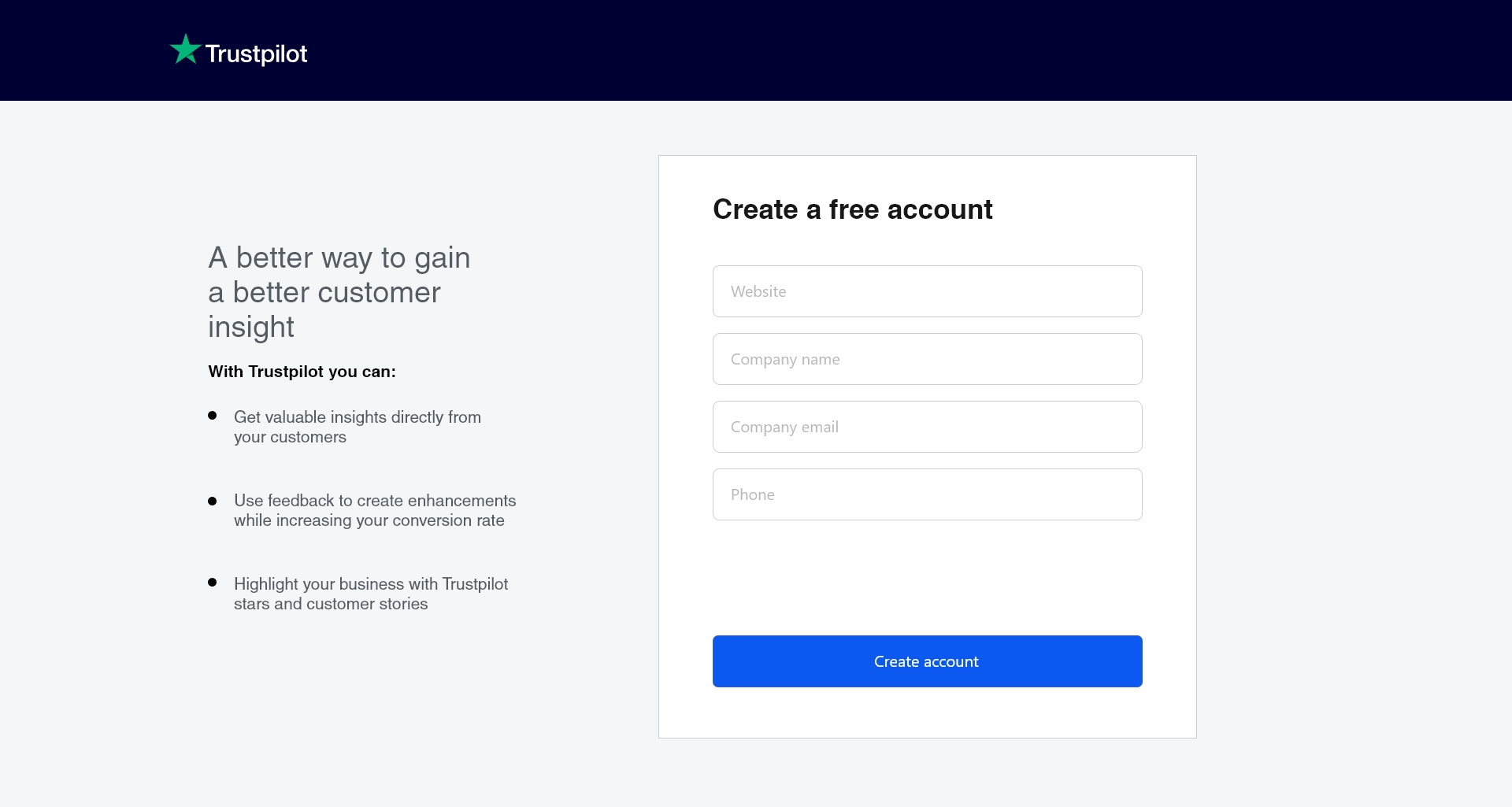
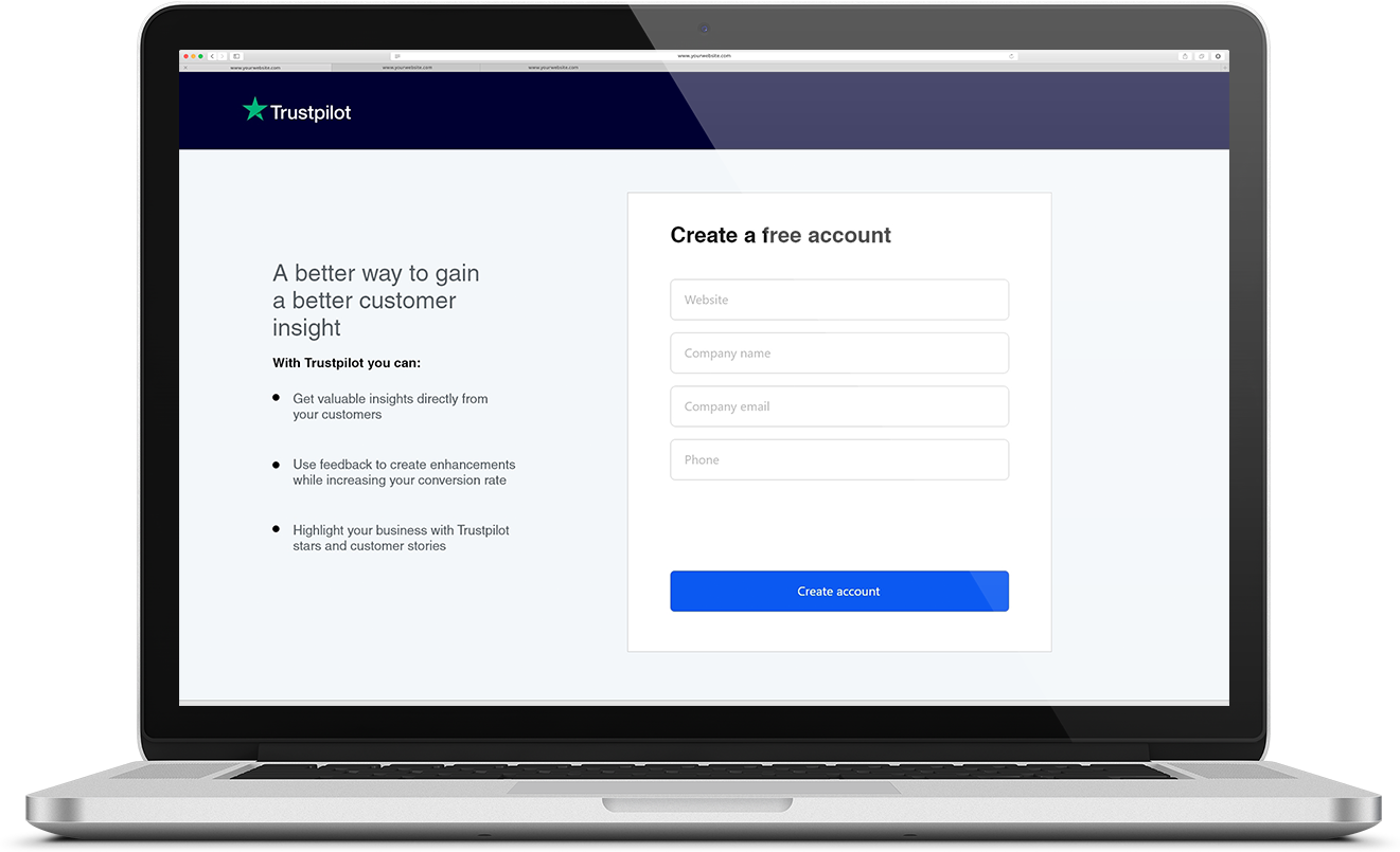
Trustpilot is a consumer review website. The site is free for consumers and it offers freemium services to businesses. The target group for this project is “Non tech-savvy business owners of a small company (less than 15 employees) with a company website using the Free Business Platform.
Details
Client
Trustpilot
Consumer Review Platform
My focus
Google Venture Sprint, UX and UI design, Prototyping, User journeys
Period of development
April 2019
1 week
Case
The case for this project was about making the onboardnig flow for businesses less complicated and easier to complete
Google Ventures Sprint
We used the Google Ventures Sprint as framework for the project.
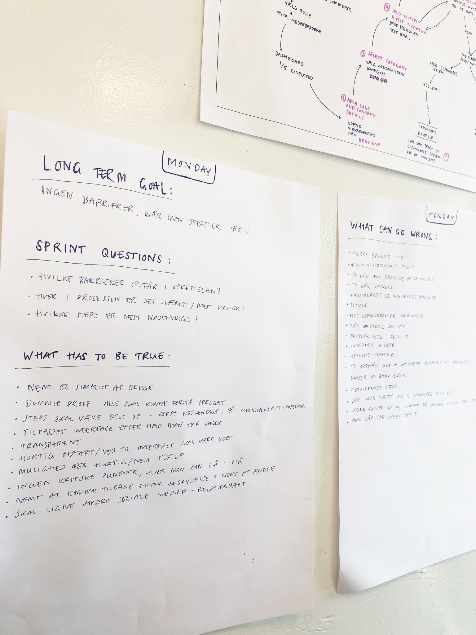
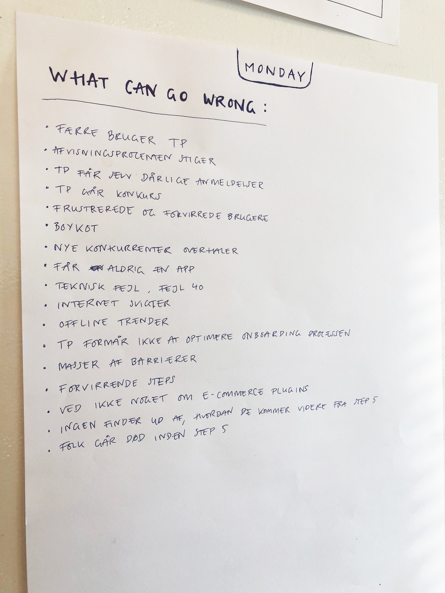
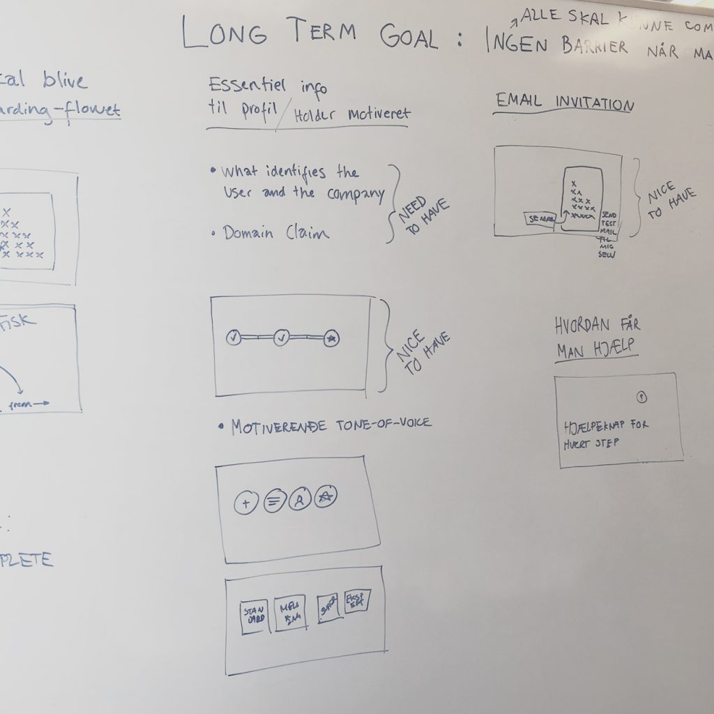
Long Term Goal,
Sprint Questions
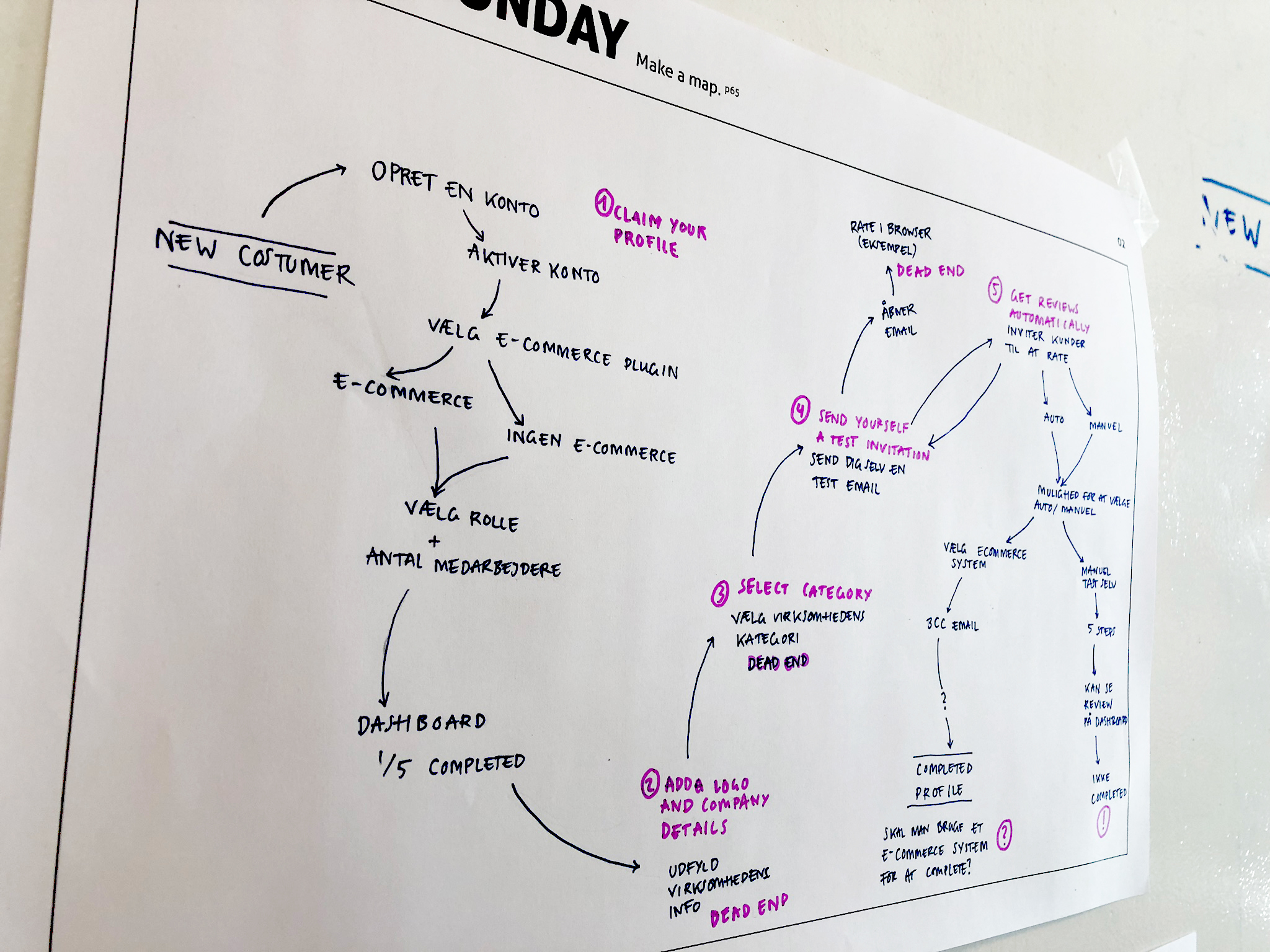
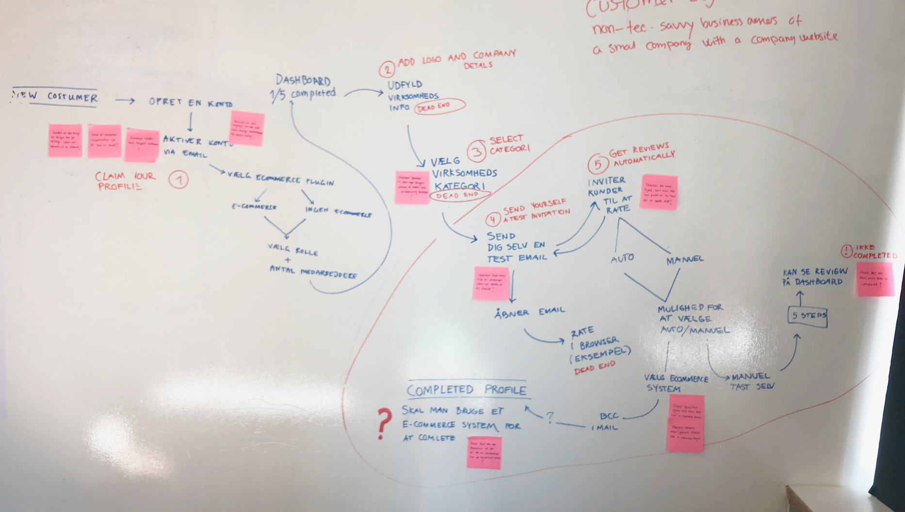
Mapping,
How Might We Post'its
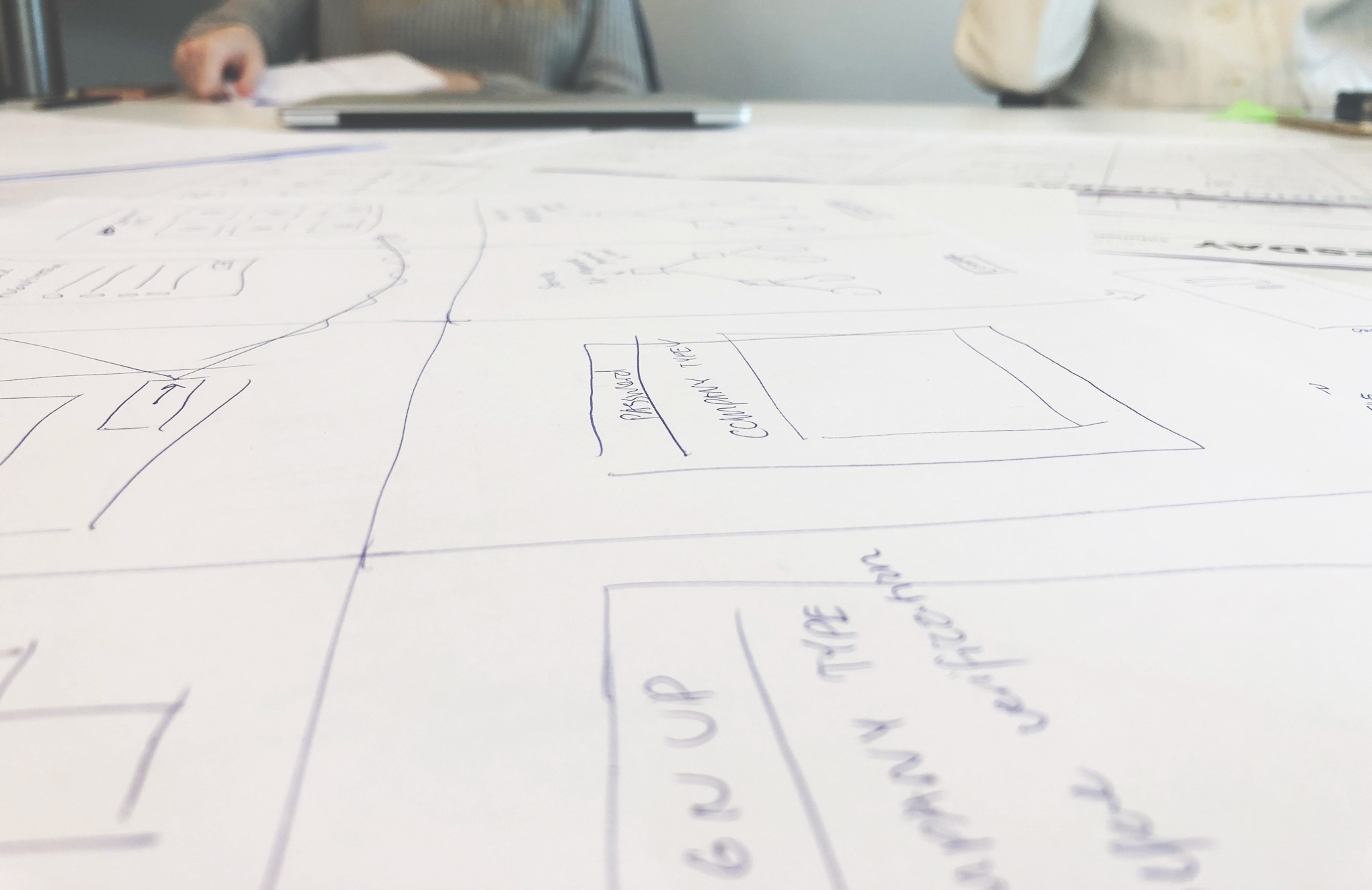
Lightning demos,
The Four-Step Sketch,
Crazy 8's and more
Sticky decision,
Make a storyboard
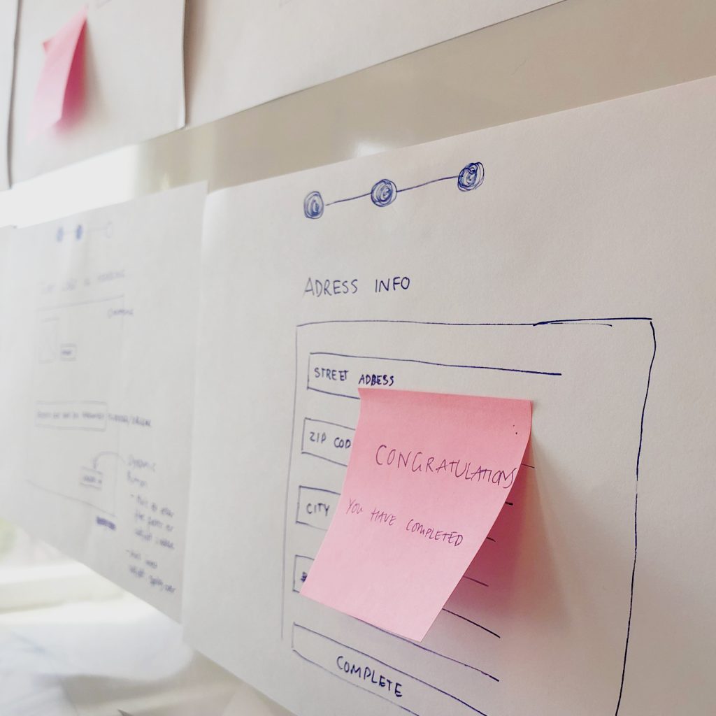
"Before" and "After" map
Before
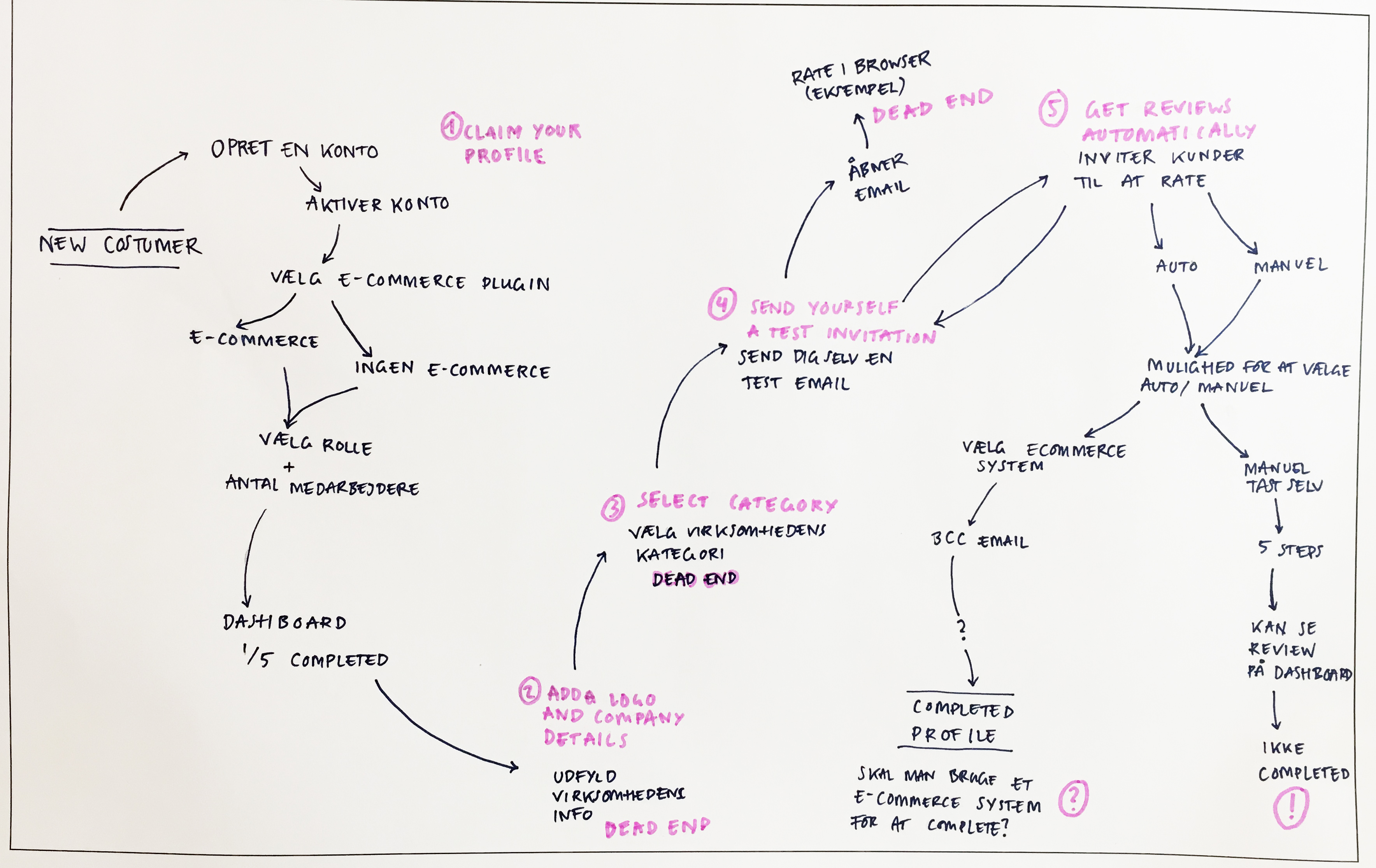
After
Client Feedback
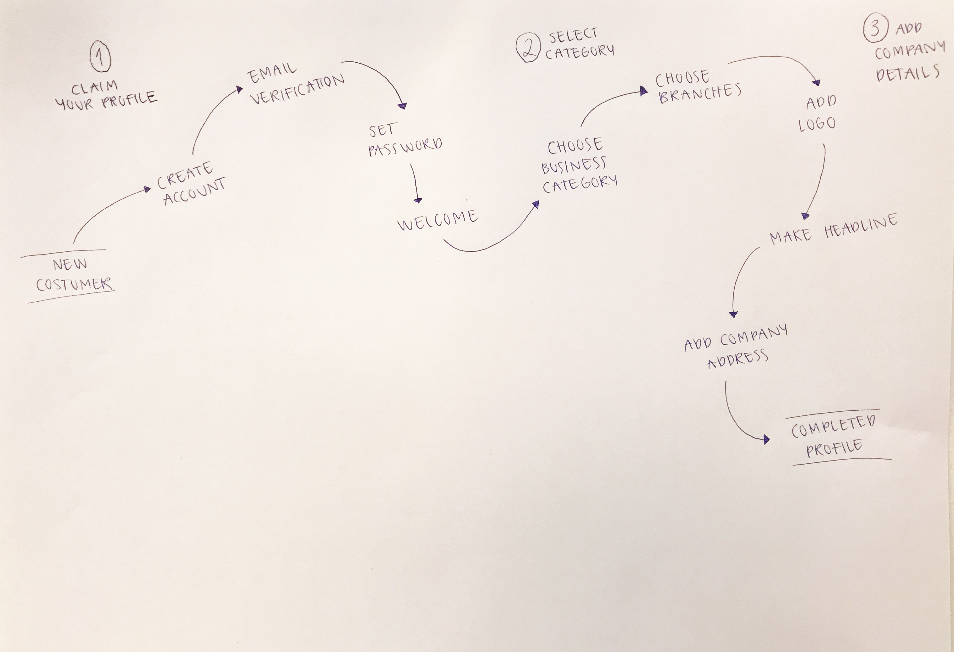
We recieved quite positive feedback fromTrustpilot UX and development team. They expressed their excitement about the visualization of the “before” and “after”- map, and the visualization of the current dead ends in our process.
They told us that this prototype matches their values of transparency very well and that they are actually discussing the company categories internally and they would like to consider the headline feature to be a part of a new solution.
Future suggestions
Based on our tests it was clear to us that users were uncertain why they would have to create a very heavy password for their Trustpilot business account.
Since some user tend to be frustrated about too many critiria for making a password, it might be usefull to cut down on criterias. This could be a solution for those users who unatendently ends up in the “forgot your password”-flow and avoid additional frustration and bouncing.
Users expressed
“I don’t see why this password would have to be just as important as the one for my bank account”
Rockwool Wecraft
DIGITAL CONCEPT / APP Rockwool Wecraft This project was about creating a new solution that can streamline logistics and workflow at construction sites. Rockwool wanted a solution that focuses on the transition between transport and delivery of building materials and handling of materials at the construction site. This solution should help prevent errors and misunderstandings […]
Homeless
DIGITAL CONCEPT / APP Homeless The app “Homeless”, makes it possible for Danish companies to offer homeless people in Denmark donation of meals. Companies can offer excess food from the catered lunch or cafeteria to the homeless. The homeless people get a meal without collecting leftovers from the city’s trash can and the companies earn […]
Wine and dine
MICRO WEBSHOP Wine and dine During the “Digital content” course, I designed a microshop, using the WordPress theme “Page Builder Framework” and the “Elementor” plugin. Furthermore I got acquainted with YOAST plugin for SEO. For this site I wrote all of the content and photographed and edited the images myself. I decided to make a […]
