
Nestea redesign
PRODUCT REDESIGN / BRANDING Nestea packaging This was my first assignment during the “Digital content” course, working with archetypes and redesign during a week. I chose ‘creator’ as my archetype and made a resdesign of Nestea ice tea bottle packaging. The mock up to the right shows my result. Details Client Nestea (non official) My […]
nemlig.com
DIGITAL CONCEPT / WEB APP nemlig.com As the first project on Digital Concept Developement we designed a new concept for nemlig.com. This concept evolved around changing the habits in everydaylife. Our approach was a digital web application based on machine learning, designed to costumize the final product to the costumers wishes and needs. Details Client […]
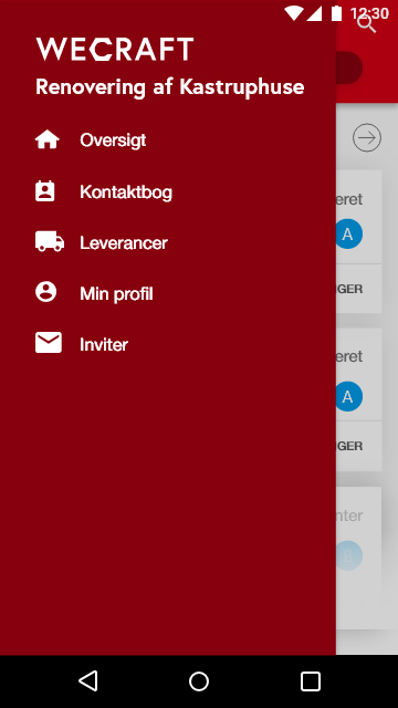
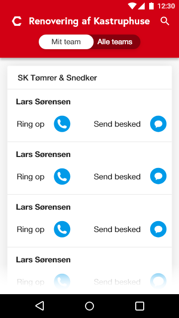
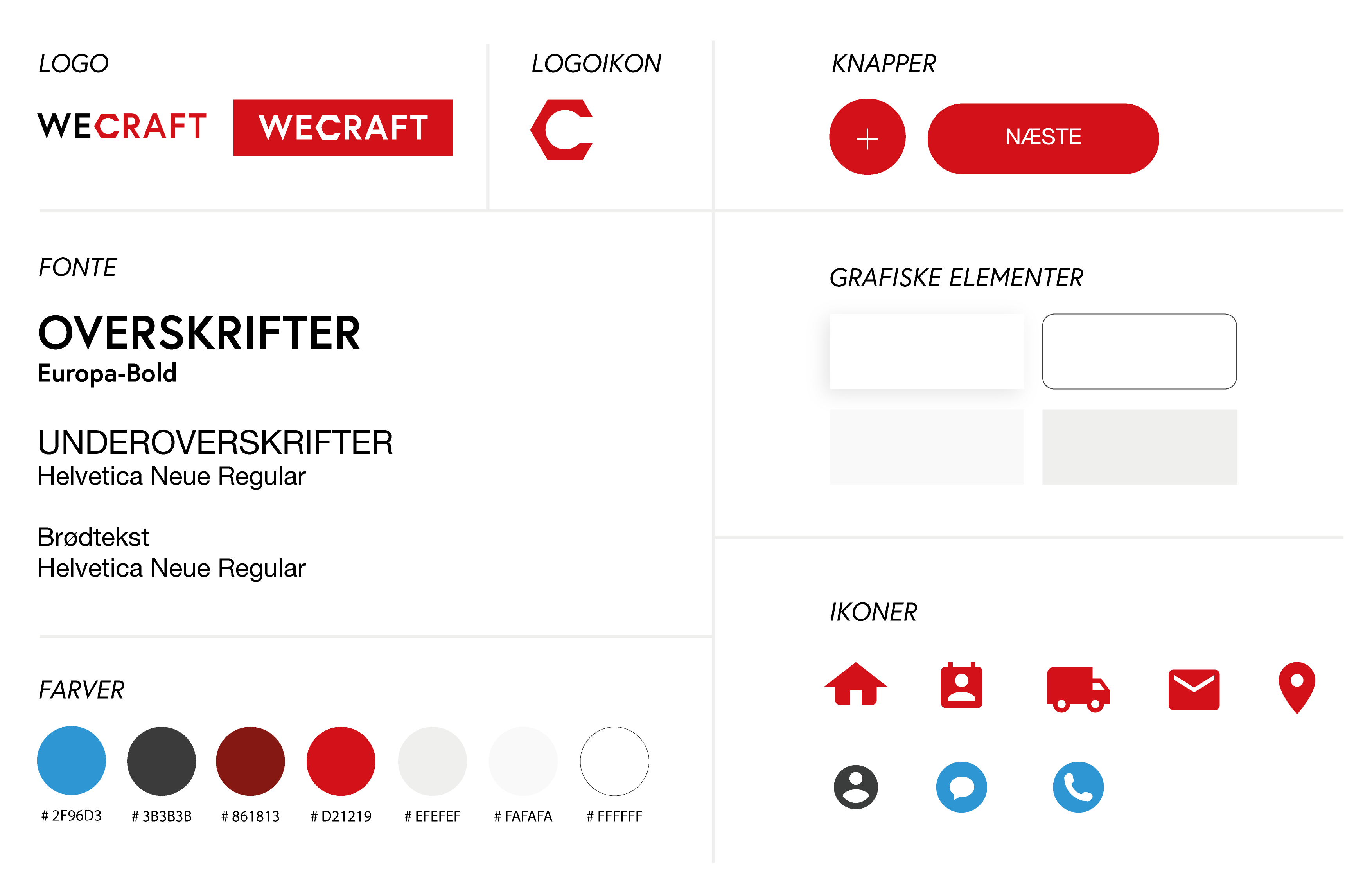
Rockwool Wecraft
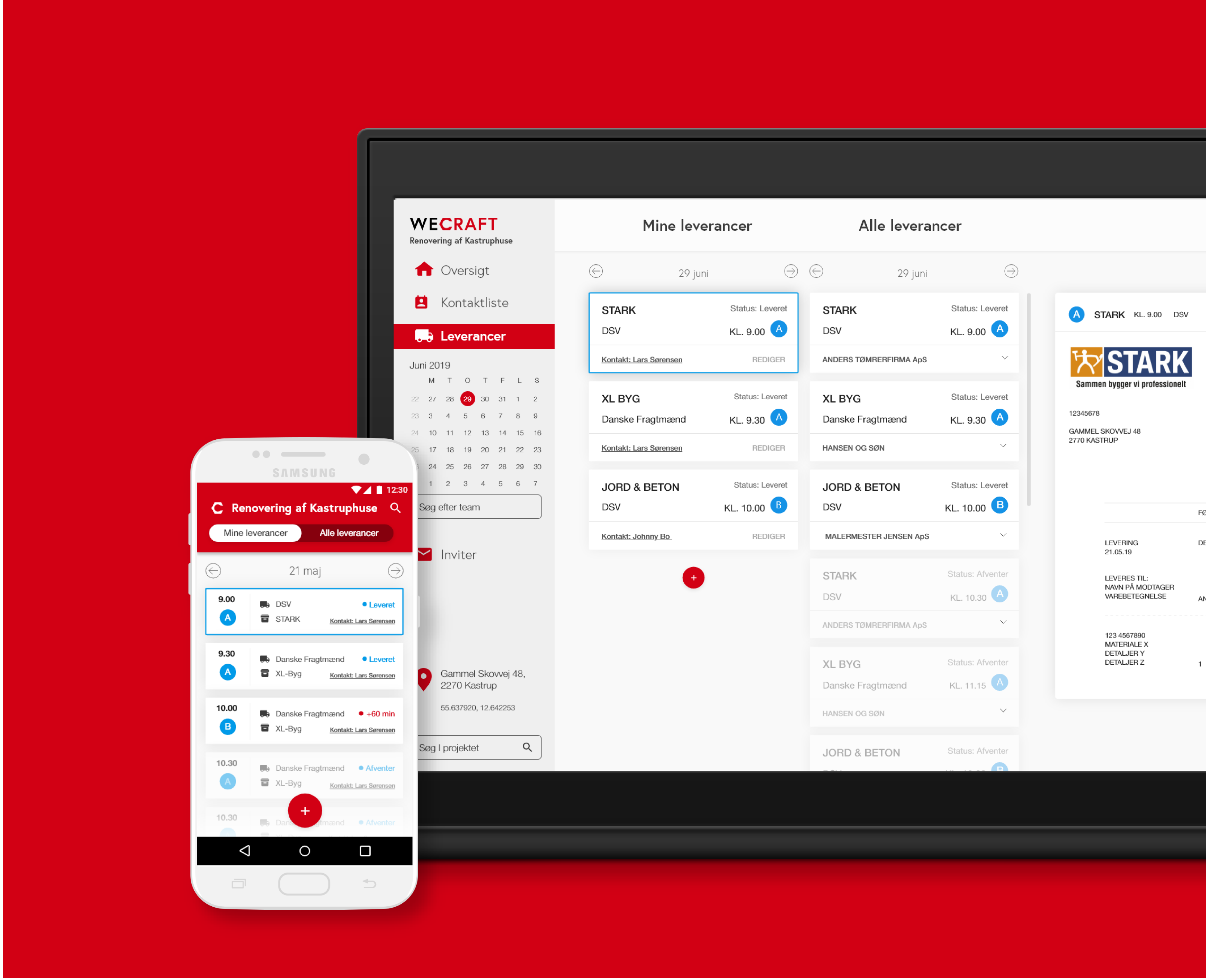
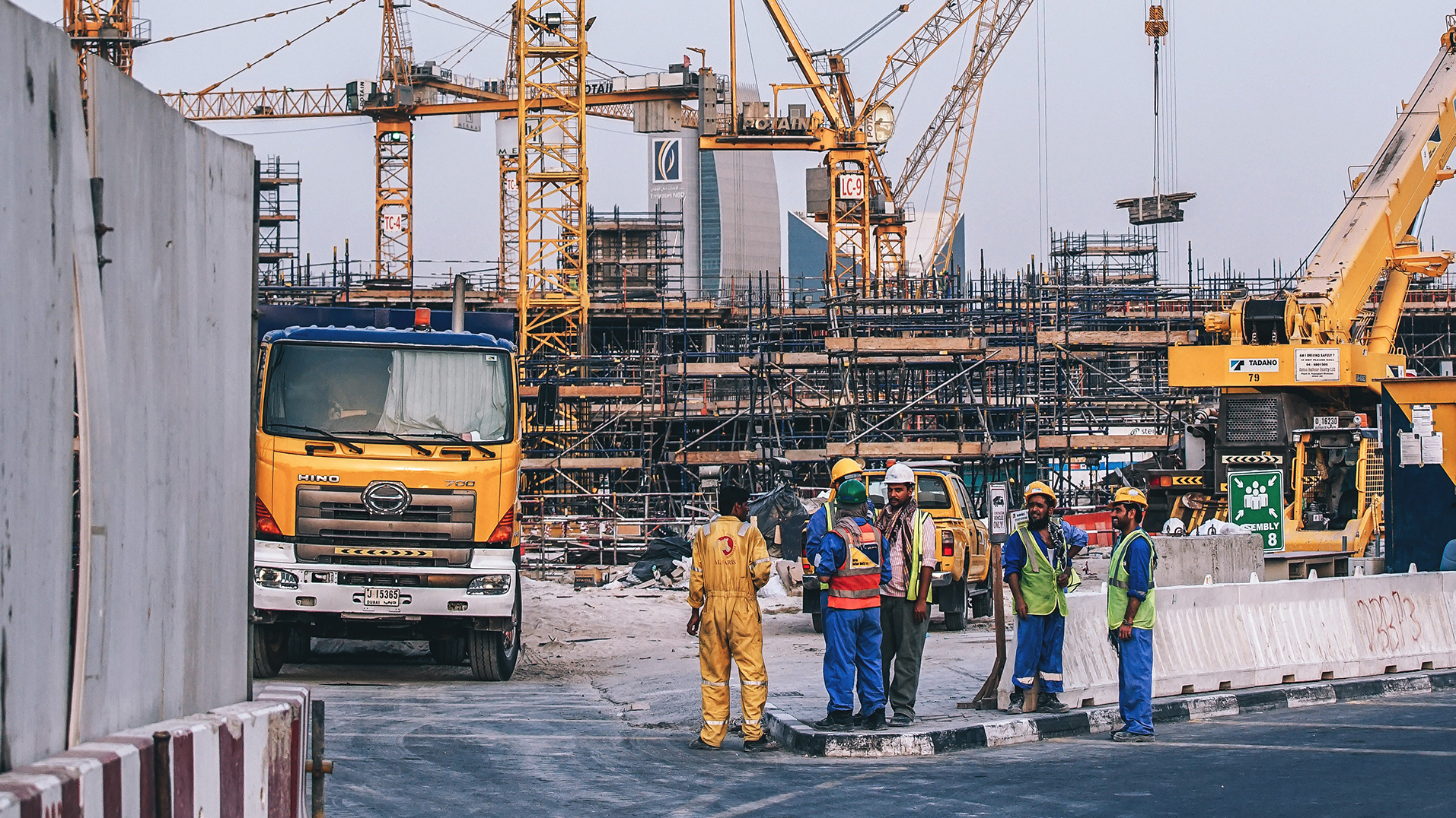
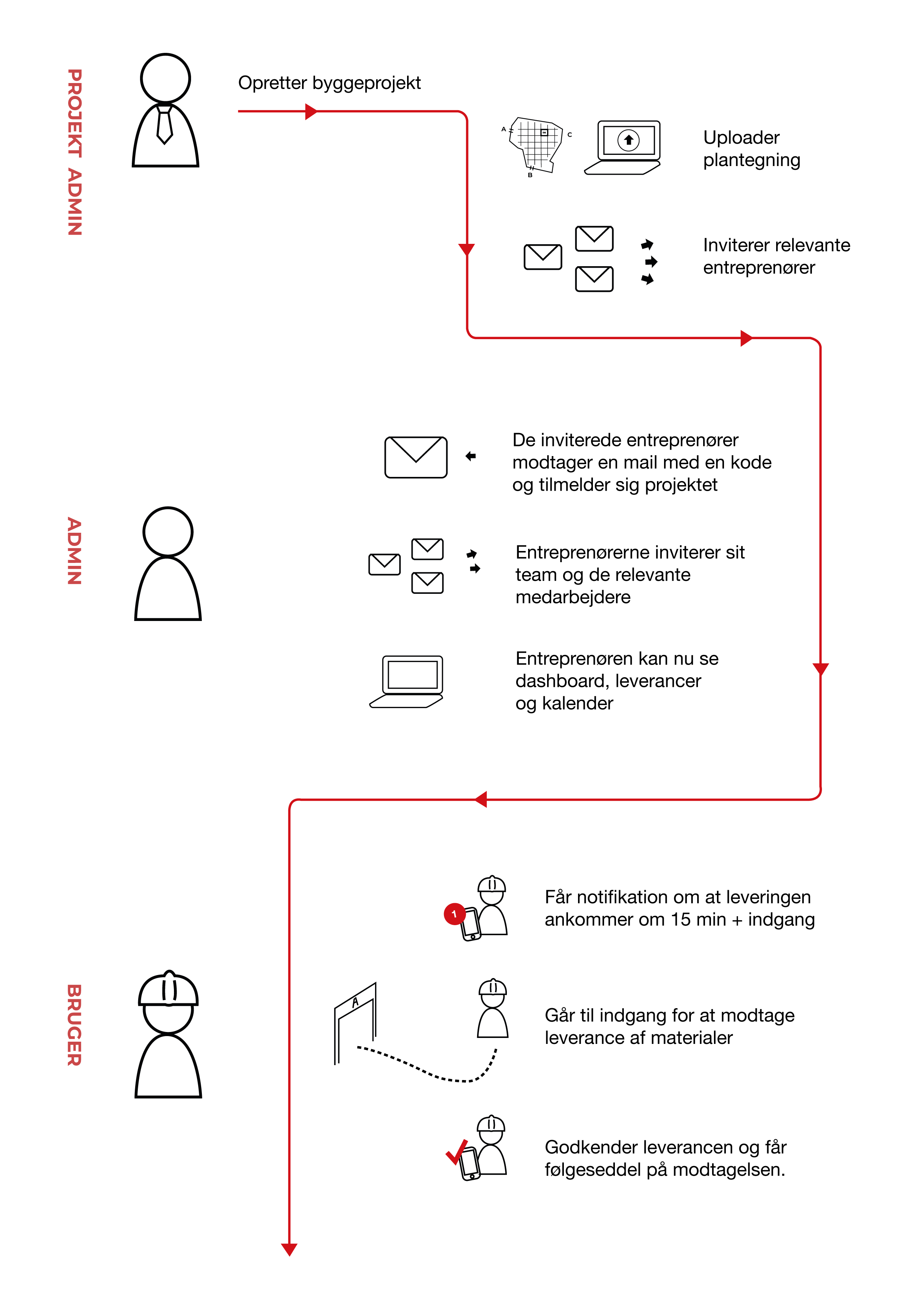
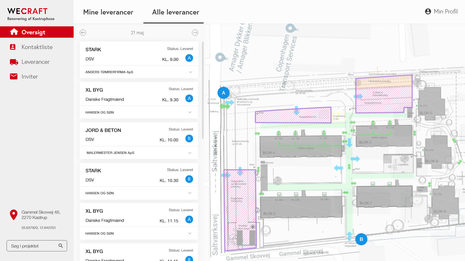
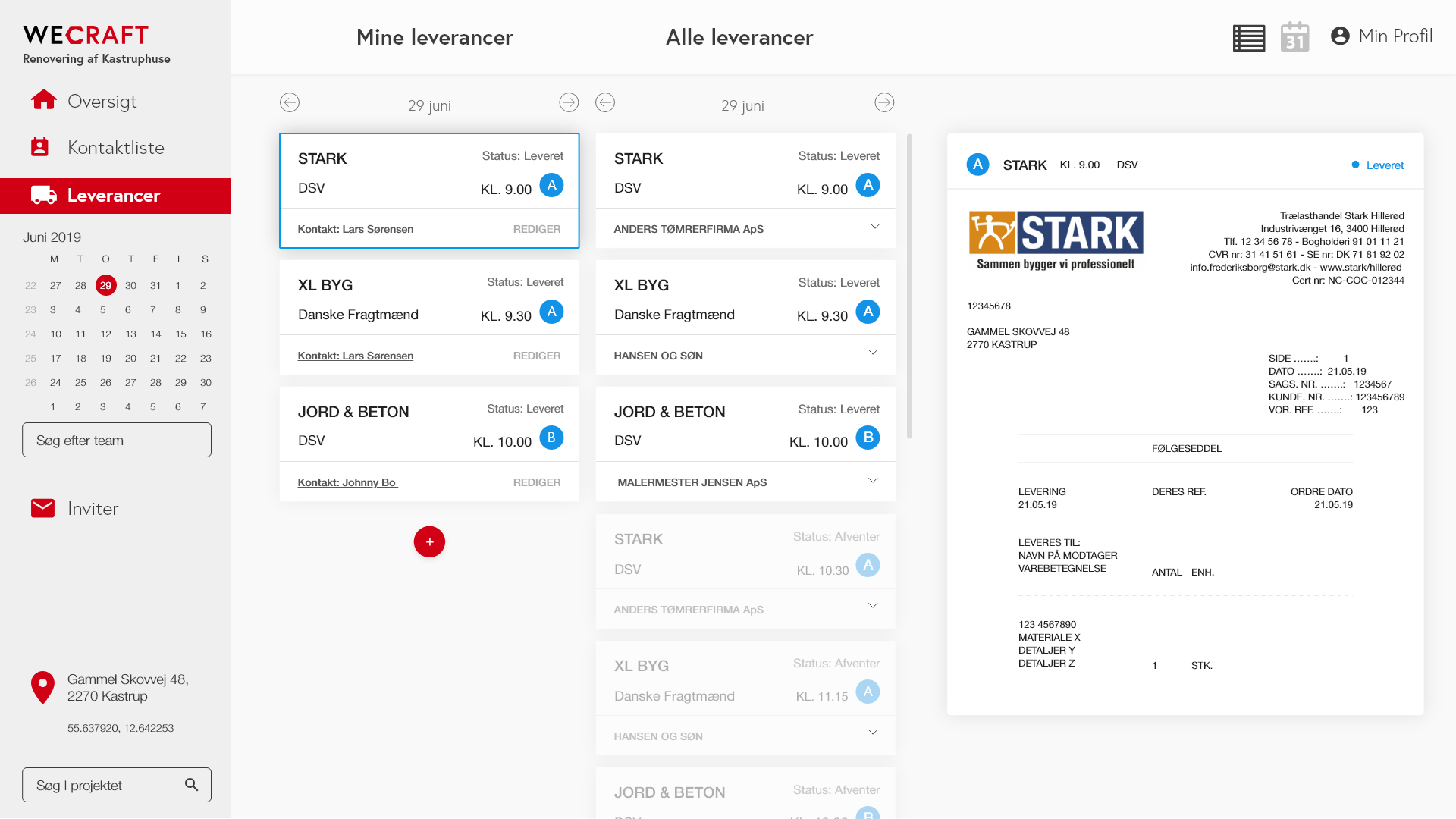
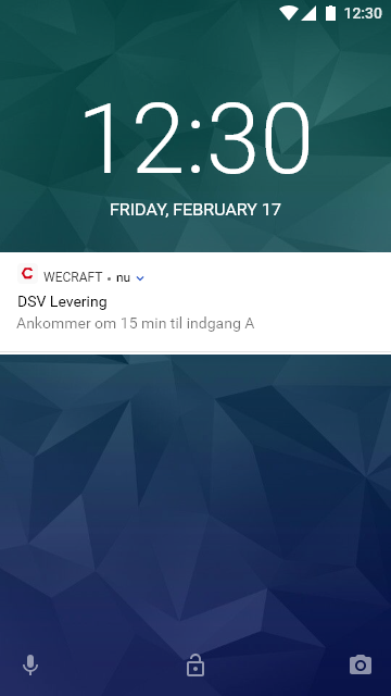
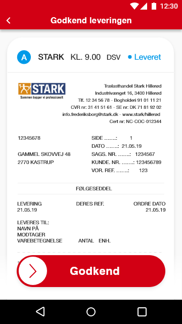
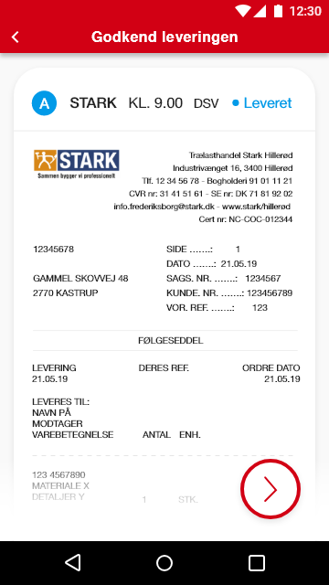
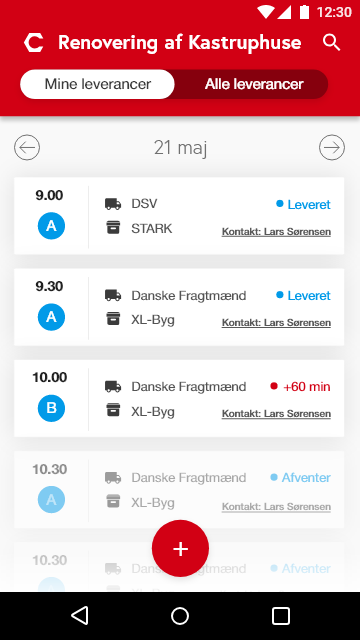
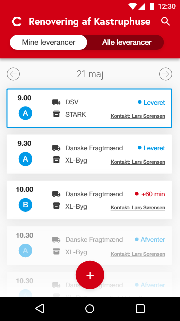
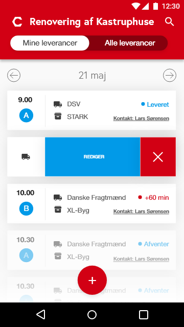
DIGITAL CONCEPT / APP Rockwool Wecraft This project was about creating a new solution that can streamline logistics and workflow at construction sites. Rockwool wanted a solution that focuses on the transition between transport and delivery of building materials and handling of materials at the construction site. This solution should help prevent errors and misunderstandings […]