DIGITAL CONCEPT / APP
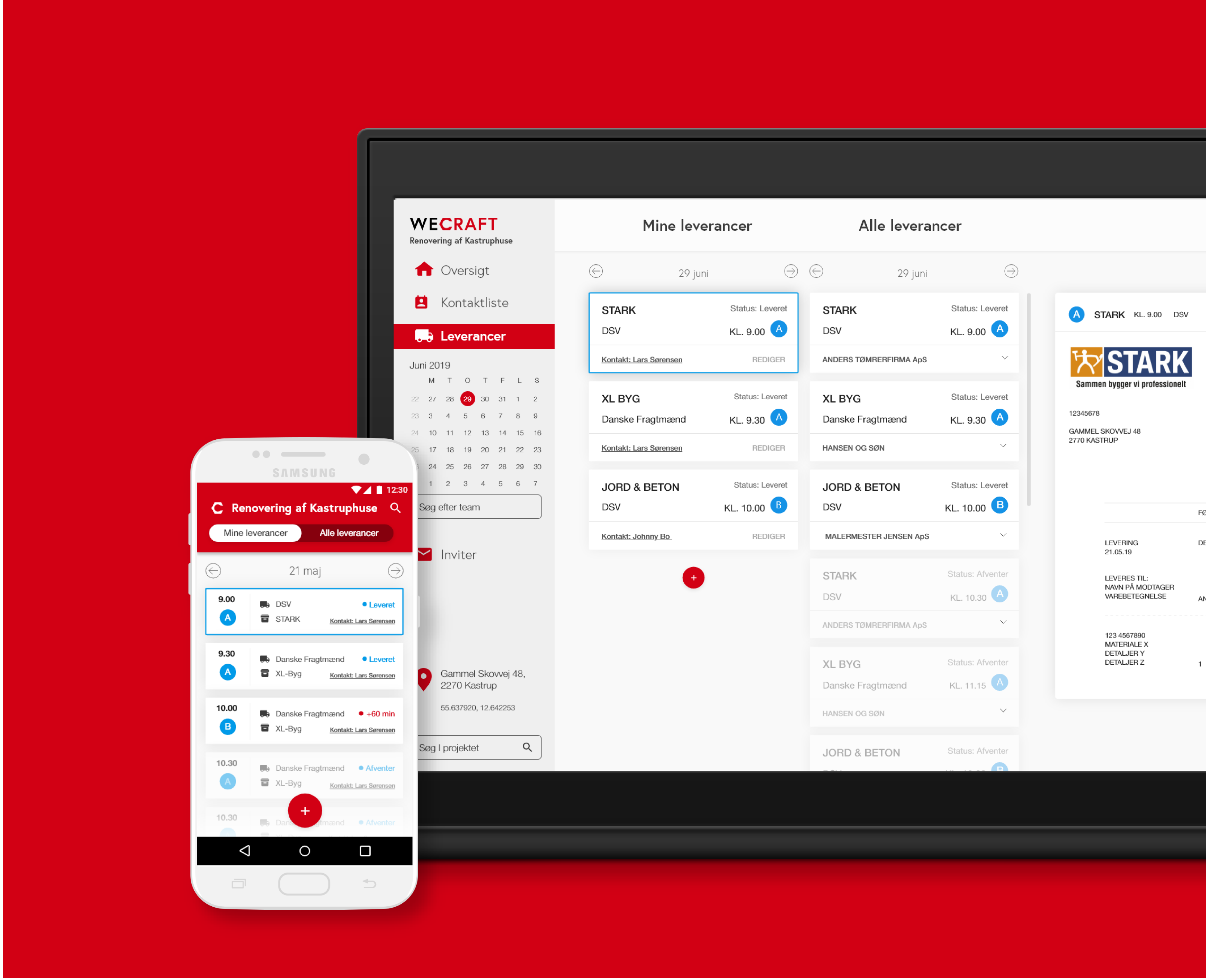
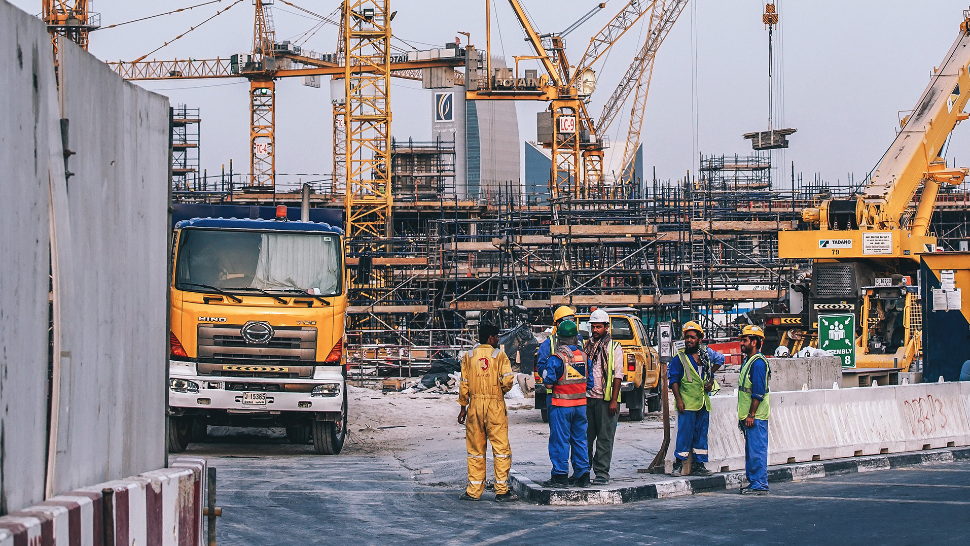
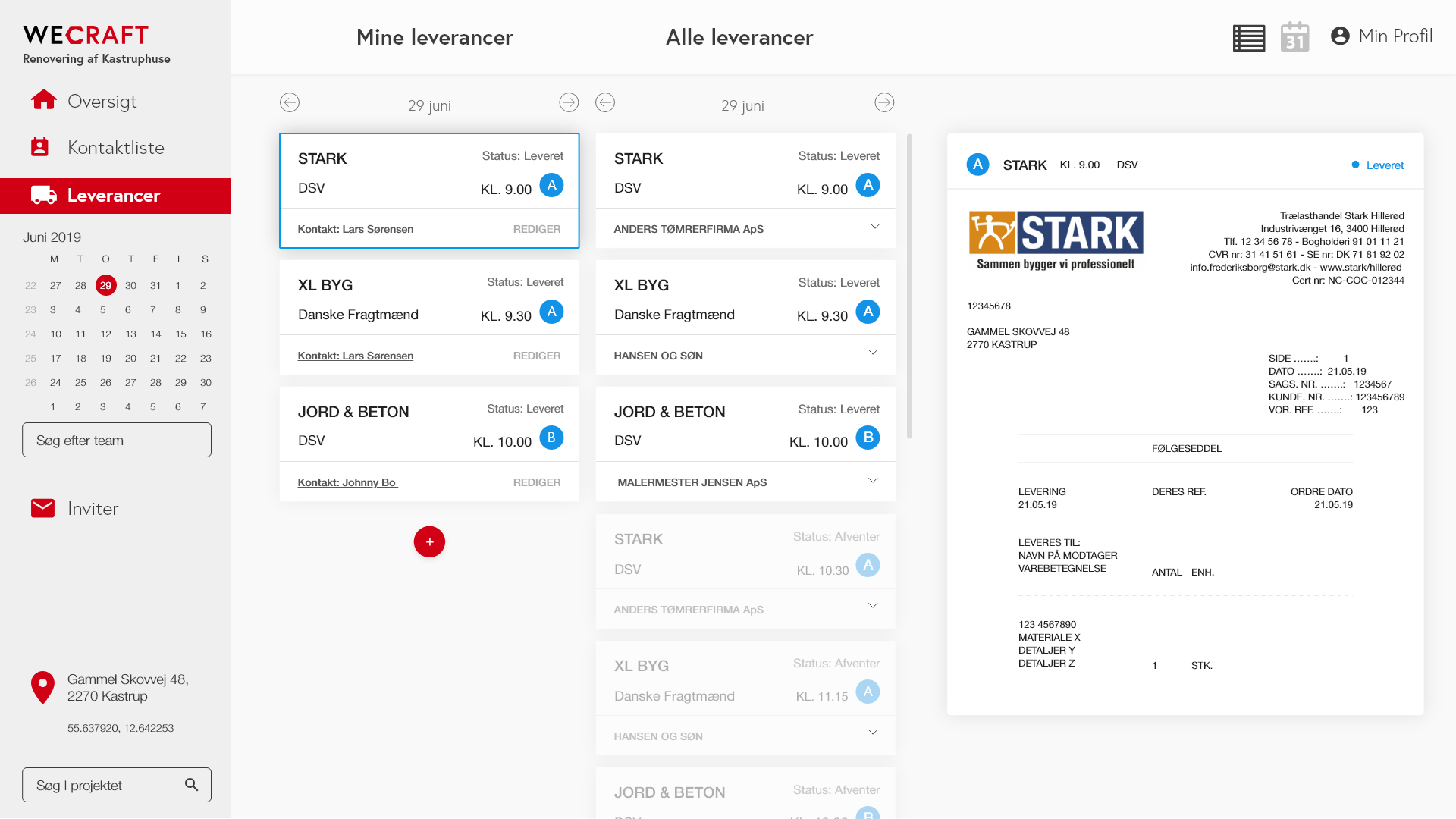
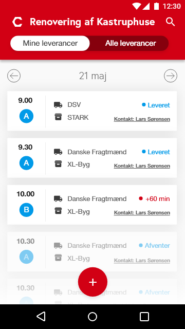
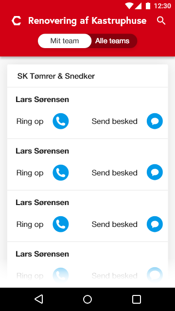
This project was about creating a new solution that can streamline logistics and workflow at construction sites. Rockwool wanted a solution that focuses on the transition between transport and delivery of building materials and handling of materials at the construction site. This solution should help prevent errors and misunderstandings during the delivery of materials, streamline construction workflows and improve internal communication. My study group and I developed a prototype that meets this need and can also be combined with Rockwool’s desire for a solution that can help the construction site locate their materials.
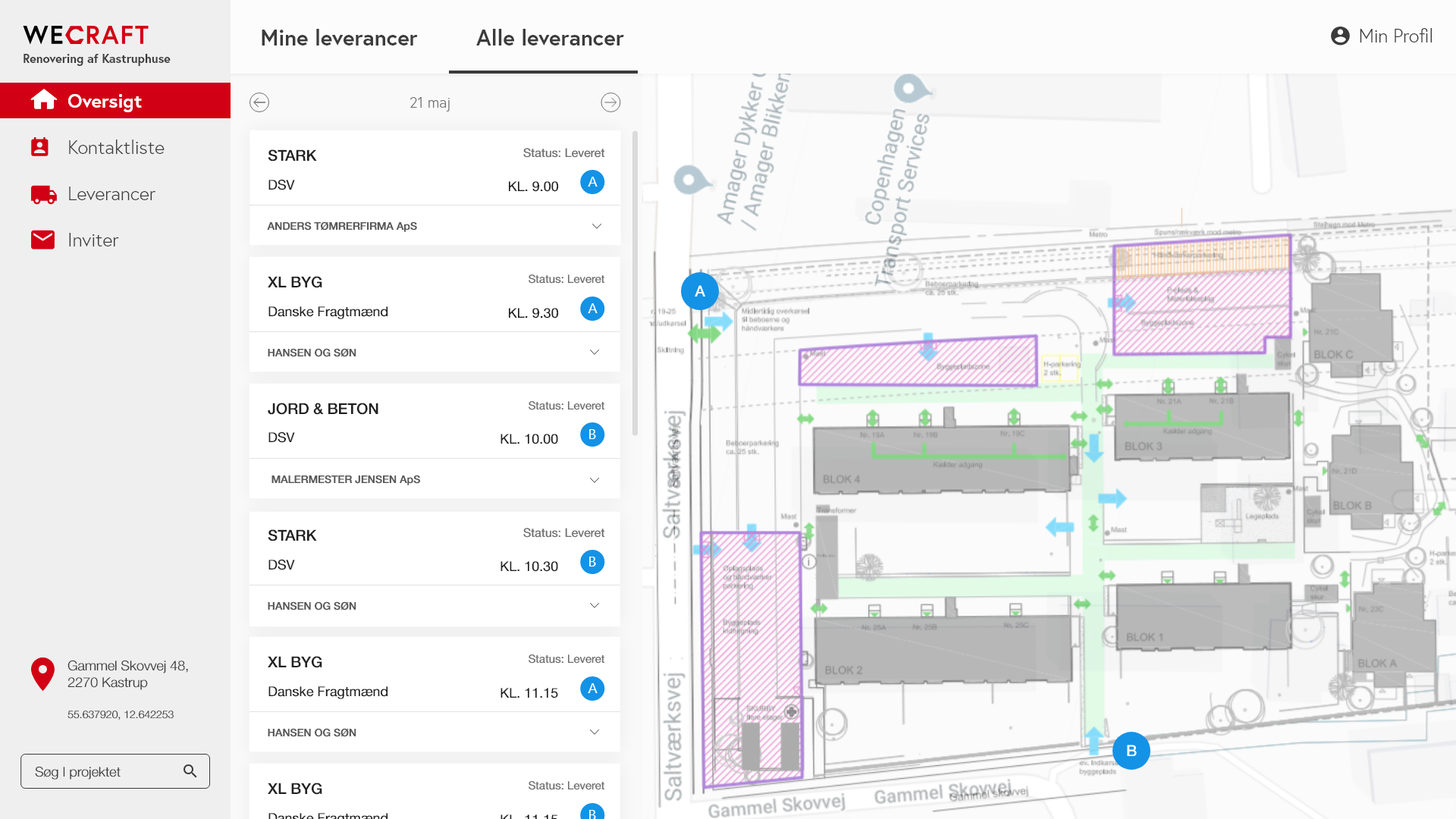
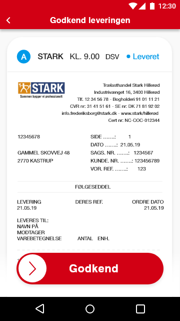
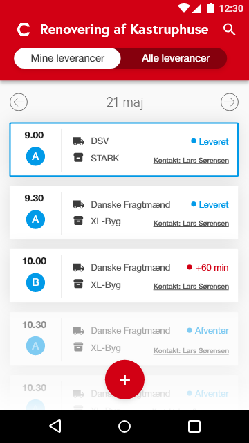
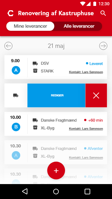
The solution allows users to plan and organize deliveries, both in terms of time and location at the construction site. It allows the different parties to see an overview of their own and others’ ordered deliveries.
Details
Client
Rockwool
My focus
Prototyping, different user scenarios, user journey, UI design, app design
Period of development
February 2019 / March 2019
4 weeks
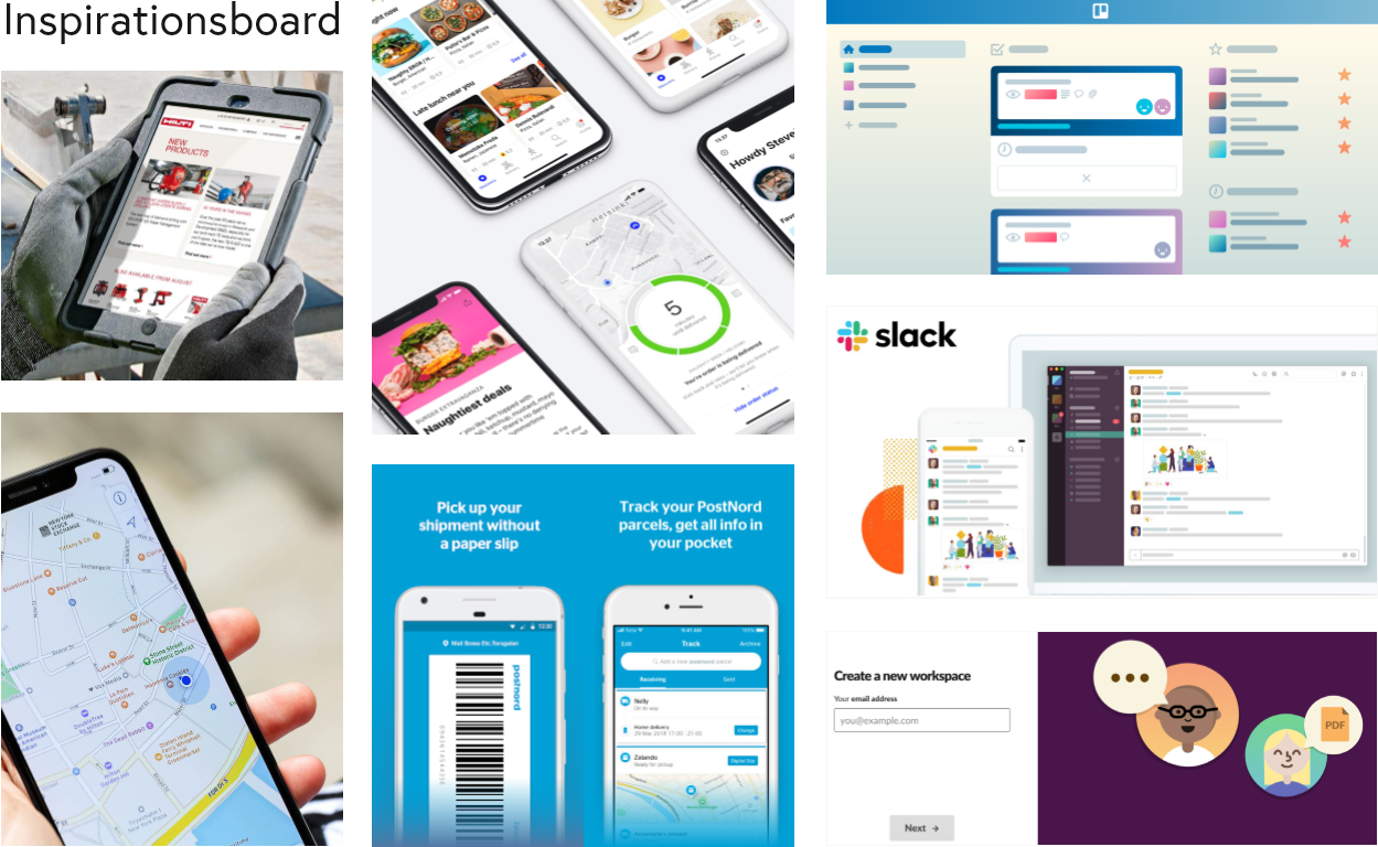
Moodboarding and inspiration
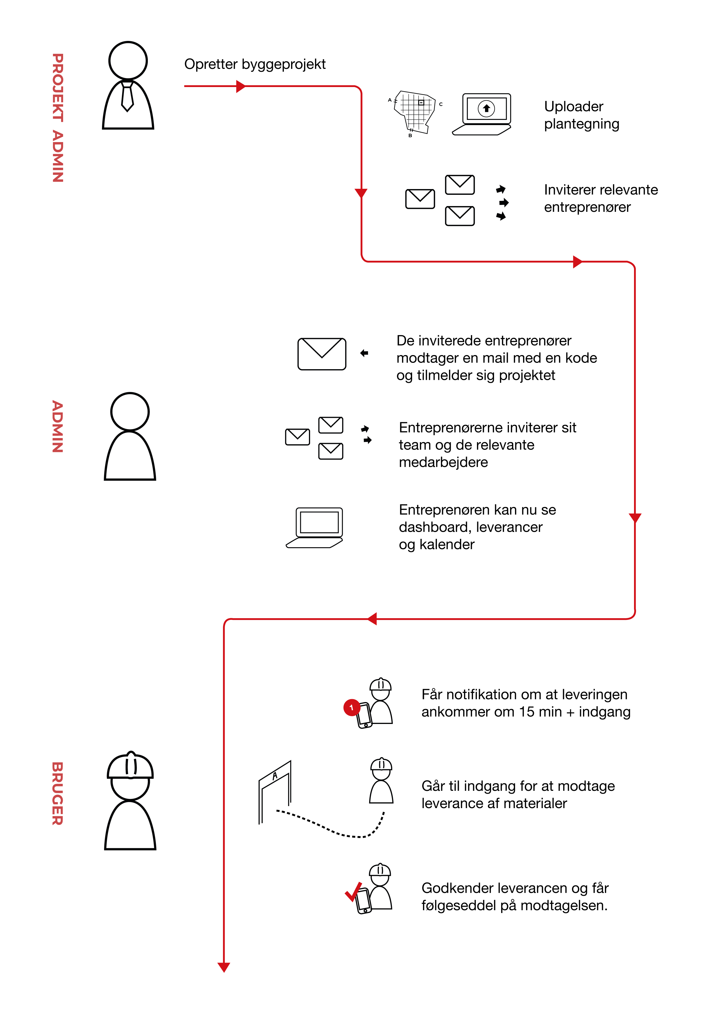
Personas og brugerrejser
Desktop app
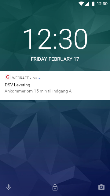
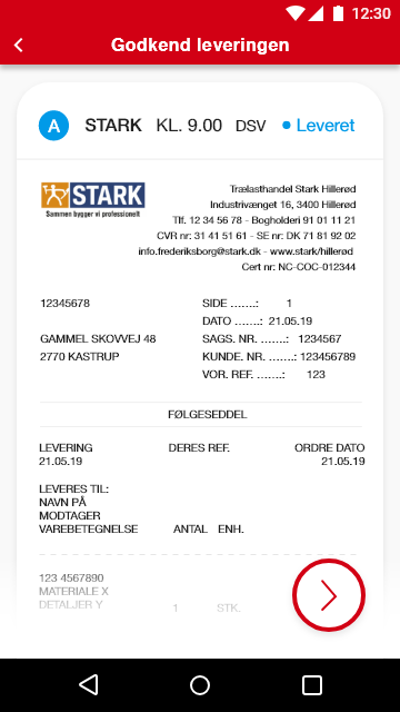
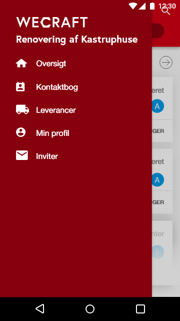
Android app
Styleguide
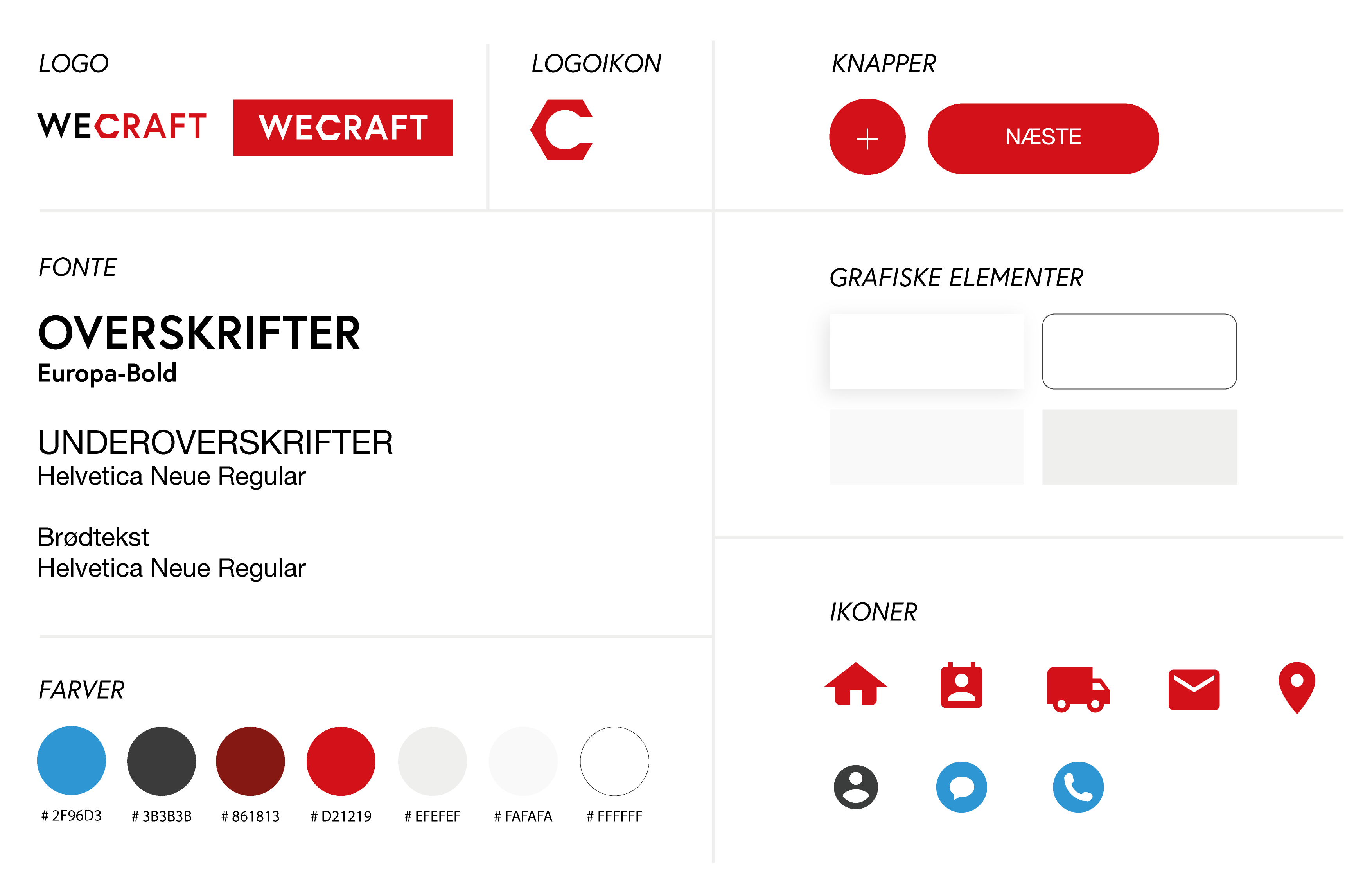
Rockwool’s own red color is used as a signature color for the most important elements of the app. The red color is integrated on icons, buttons and in the logo. In this way Rockwool is represented without their Rockwool logo being directly present in the app but still being the owner of the app. In addition, there are several construction companies that use a red color, which also means that users will already identify the color with the construction industry.
The other colors are in light gray shades, to give contrast to the red color. This creates a neutral and calm expression, thus increasing the focus on the important elements in the app.
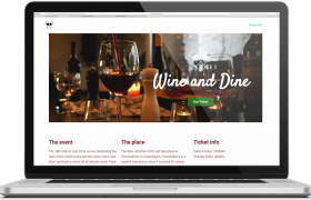
Wine and dine
MICRO WEBSHOP Wine and dine During the “Digital content” course, I designed a microshop, using the WordPress theme “Page Builder Framework” and the “Elementor” plugin. Furthermore I got acquainted with YOAST plugin for SEO. For this site I wrote all of the content and photographed and edited the images myself. I decided to make a […]
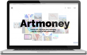
Artmoney
COMPLEX WEBSITE / REDESIGN Artmoney This project is a redesign of Artmoney.org we made for our 3rd semester exam. Artmoney is for users interested in making art and being able to use it as payment. The redesigned website is about making the concept of Artmoney understandable to new users. It is also about creating a […]
Homeless
DIGITAL CONCEPT / APP Homeless The app “Homeless”, makes it possible for Danish companies to offer homeless people in Denmark donation of meals. Companies can offer excess food from the catered lunch or cafeteria to the homeless. The homeless people get a meal without collecting leftovers from the city’s trash can and the companies earn […]
