


Nestea redesign
PRODUCT REDESIGN / BRANDING Nestea packaging This was my first assignment during the “Digital content” course, working with archetypes and redesign during a week. I chose ‘creator’ as my archetype and made a resdesign of Nestea ice tea bottle packaging. The mock up to the right shows my result. Details Client Nestea (non official) My […]
bachelor project
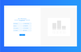
ONBOARDING FLOW Bachelor project Continuing the work from my internship I worked to create an onboarding flow, to introduce new users to the new Saas tool for thinkstep.com (now Sphera.com). This project is protected by an NDA. Details Client thinkstep.com Sustainability Consulting, Software and Data My focus Collecting data, dataprocessing, research, interaction- and navigationprinciples, user flows, designpriciples wireframing, […]
Rockwool Wecraft
DIGITAL CONCEPT / APP Rockwool Wecraft This project was about creating a new solution that can streamline logistics and workflow at construction sites. Rockwool wanted a solution that focuses on the transition between transport and delivery of building materials and handling of materials at the construction site. This solution should help prevent errors and misunderstandings […]