REDESIGN OF SOFTWARE USER INTERFACE
Innovative User Experience Project
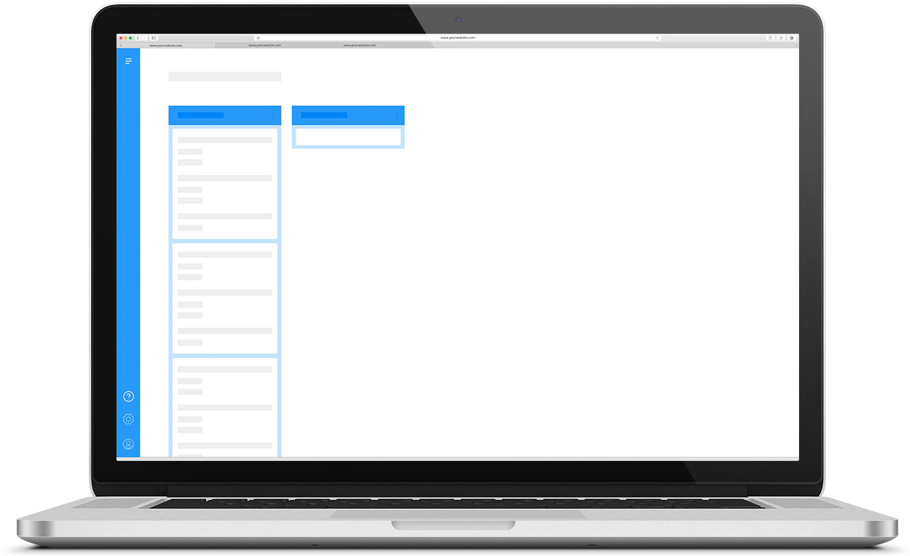
During my last semester on KEA I was a User Experience Designer Intern at Kruso where I worked as a part of the UX team to redesign a complex software for thinkstep.com (now Sphera.com)
This project is protected by an NDA.

Details
Client
thinkstep.com
Sustainability Consulting, Software and Data
My focus
Collecting data, dataprocessing, research, interaction- and navigationprinciples, user flows, wireframing, prototyping, user testing.
Period of development
September 2019 - December 2019
4 months
Innovative project
focusing on the user
This project focused on the user to redesign the software interface and to make it easier for users to complete LCA calculations.
Interviews and
observations
To collect data and knowlegde we interviewed both thinkstep imployees and users of the software.
Dataprocessing
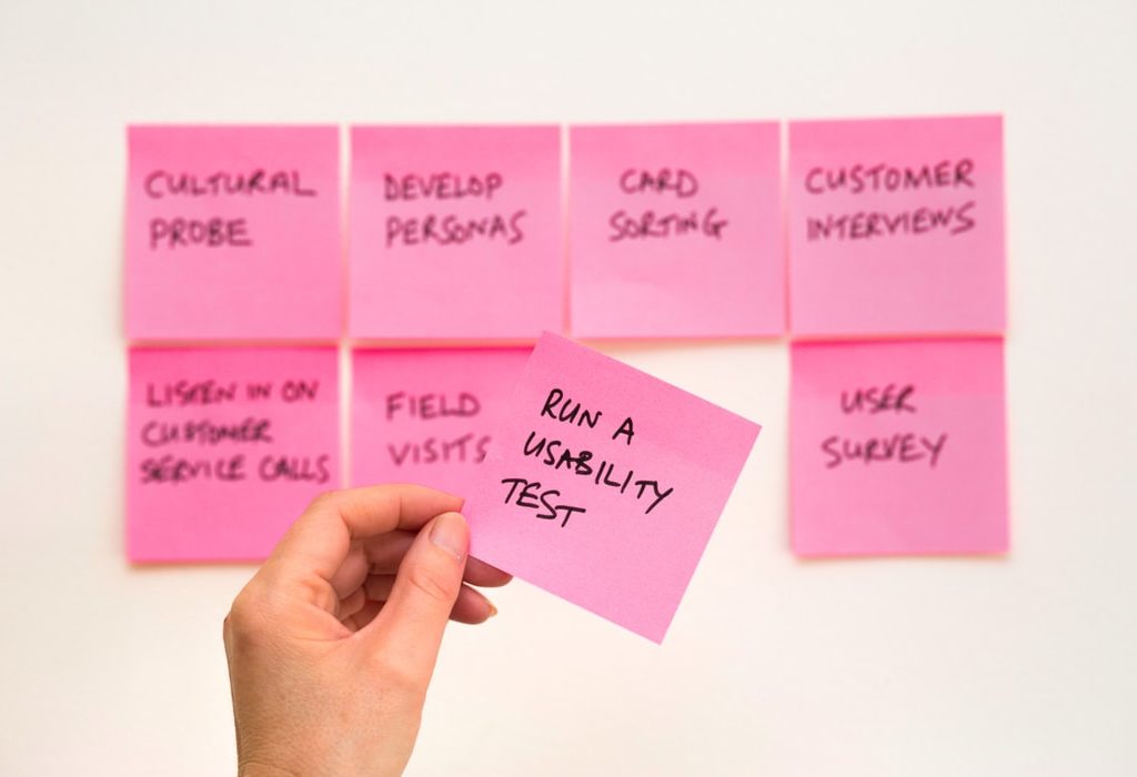
We created an Affinity diagram and collected all the data from interviews and observations. Then all relevant statements are sorted and group to recognize patterns between users. Lastly generate 5-7 key findings presented to the customer.
Wireframing and prototyping
Producing wireframes and initially a prototype to be tested on relevant users.
What I've learned
During my internship at Kruso I experiend to be an integrated part of a larger workplace while gaining experience from an agency. I was part of the professional and creative UX team from which I learned how to navigate in both creative processes and administrative tasks. In terms of the project on the thinkstep software I was able to use my own experiences in moodboarding, wireframing and prototyping, but I also learned from others in a large part of the process.
I learned a lot from working more extensively with user surveys, data collection and data processing which was a great for me to becoming proficient in recognizing patterns and coincidences between users.
During the internship, I worked extensively with UX conventions, UX design, user flows and design priciples which was a great learning experience.
User testing
The prototype was tested on existing users from a big danish company and resulted in positive and constructive feedback.

Client Feedback
We recieved quite positive feedback from thinkstep.com, both from the Director of the Nordics, Ulf Gilberg, and from the german headquaters. They both expressed the possibility of developing their product in the direction that the prototype suggests.
Future suggestions
Since the prototype is still in a very lowfi version, the new Saas interface design would need more specific details to support the all the different usecases that exists. Furthermore the prototype needs a complete user interface design to make the hierarchy and functions seem more realistic to support the user experience.
Innovative user experience project
REDESIGN OF SOFTWARE USER INTERFACE Innovative User Experience Project During my last semester on KEA I was a User Experience Designer Intern at Kruso where I worked as a part of the UX team to redesign a complex software for thinkstep.com (now Sphera.com) This project is protected by an NDA. Details Client thinkstep.com Sustainability Consulting, Software and Data […]
Artmoney
COMPLEX WEBSITE / REDESIGN Artmoney This project is a redesign of Artmoney.org we made for our 3rd semester exam. Artmoney is for users interested in making art and being able to use it as payment. The redesigned website is about making the concept of Artmoney understandable to new users. It is also about creating a […]
Outrage
HANDMADE TYPOGRAPHY Outrage I designed my own typography during the “Digital content” course. This is designed for the outlaw-archetype. I used a blade from a utility knife and black paint on white paper. This created an destructive, destroyed and chaotic expression. Furthermore I designed a couple of posters with the font (look futher down) Details […]


