DIGITAL CONCEPT / CAMPAIGN
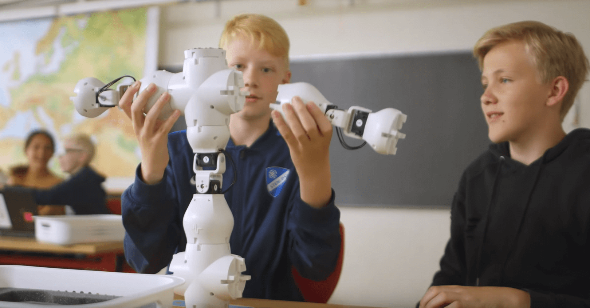
Shape Robotics specializes in robots for educational use, teaching children and young people about programming and technology. We designed a concept, containing a campaign, to make future Danish teachers aware of Shape Robotics product, the robot “Fable”, and the value of using it in educational context.
Details
Client
Shape Robotics
Robots for educational use
My focus
Generating Ideas, Visual Mockups, Prototyping
Period of development
October/November 2018
3 weeks
Case
The aim of the campaign for Shape Robotics was to secure their place on the top 3 of the most widely used educational robots in the Danish primary school within a period of 5 years.
The Concept
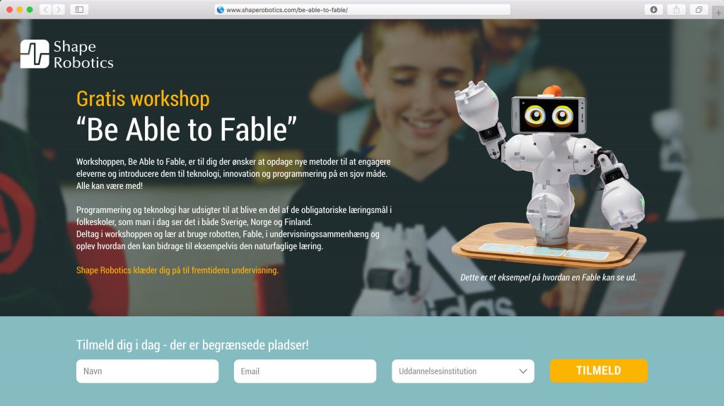
The concept consists of “Be Able to Fable”-workshops for student teachers at the country’s colleges, university and seminars. These workshops must teach and inspire student teachers to use Fable as a educational robot in primary and lower secondary school. “Be Able to Fable”-workshops should be a stepping stone for Shape Robotics, to raise awareness of their main product “Fable”. When the student teachers graduate and get a job at primary schools around the country, the knowledge about Fable will spread. “Be Able to Fable”-workshops ensure that primary school teachers can use Fable and what it means to teach children from 8 years of age in programming and technology.
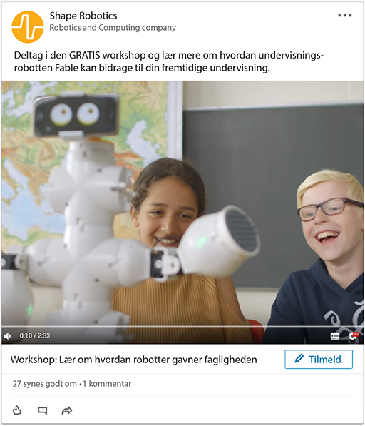
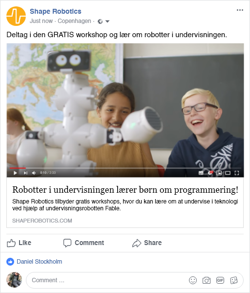
SoMe campaign

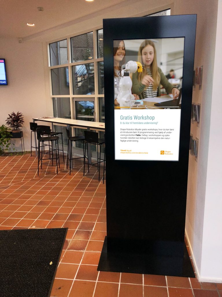
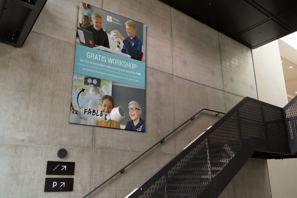
Campaign Info Screen & Poster
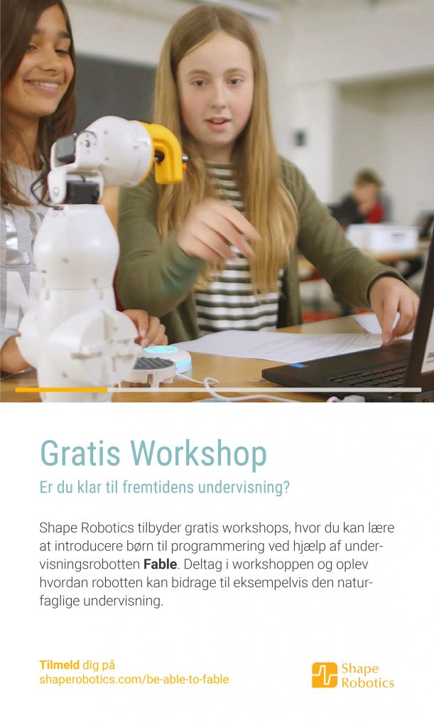
Campaign Website
Client Feedback
The feedback that we received was generally positive and was judged based on three parametres by the client. Understanding the business, implementation and creativity. They imagnined that the concept could work for other target groups as well, as it is easily converable.
“A concept that loops and can be customized, changed and expanded as not cannibalizing itself” – Shape Robotics
Own Perspective
The concept of workshops doesn’t necessarily solve the “What is in it for me” for the target user. The ”Be Able to Fable”-workshops is missing that extra feature that would convince the student teachers to make time to join in and see the value of the workshops. We slightly touched upon the idea about bringing the educational robot “Fable” into to the internship of the student teachers. This could be an interesting development of the concept.
Innovative user experience project
REDESIGN OF SOFTWARE USER INTERFACE Innovative User Experience Project During my last semester on KEA I was a User Experience Designer Intern at Kruso where I worked as a part of the UX team to redesign a complex software for thinkstep.com (now Sphera.com) This project is protected by an NDA. Details Client thinkstep.com Sustainability Consulting, Software and Data […]
Homeless
DIGITAL CONCEPT / APP Homeless The app “Homeless”, makes it possible for Danish companies to offer homeless people in Denmark donation of meals. Companies can offer excess food from the catered lunch or cafeteria to the homeless. The homeless people get a meal without collecting leftovers from the city’s trash can and the companies earn […]
Artmoney
COMPLEX WEBSITE / REDESIGN Artmoney This project is a redesign of Artmoney.org we made for our 3rd semester exam. Artmoney is for users interested in making art and being able to use it as payment. The redesigned website is about making the concept of Artmoney understandable to new users. It is also about creating a […]
